

Anyone in the creative field will tell you that to start a design, one must draw inspiration. Inspiration is often found when you research the works of historical and pioneering figures, and logo designs are no exception.
In this article, we have compiled a list of the most iconic logo designers in history to save you some time. Perhaps these examples of the best and most memorable logo designs will help get your graphic design juices flowing.
Spoiler alert; there is even a logo from 1972 that remains unchanged today!
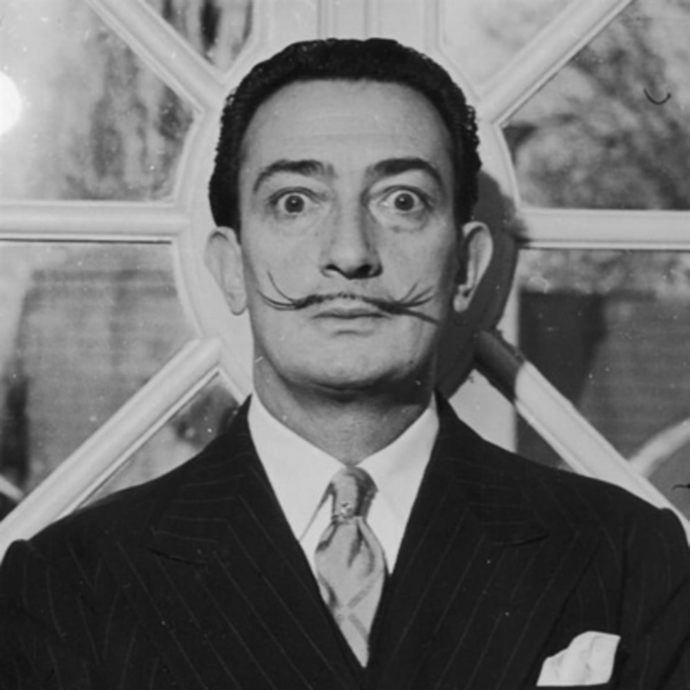 Image: Biography
Let’s start off on a sweet note courtesy of Salvador Dali, the ingenious Spanish artist behind the iconic Chupa Chups logo. The surrealist artist was tasked with the logo design in 1969 and it became instantly recognisable for children and even adults until today.
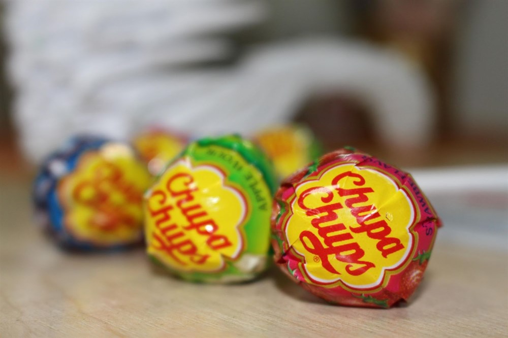 Image: Pixabay
After completing the design, Dali suggested the logo be placed on top of the lolly so that it could always be seen intact. Dali was certainly a visionary whose design has remained unchanged for over 50 years.
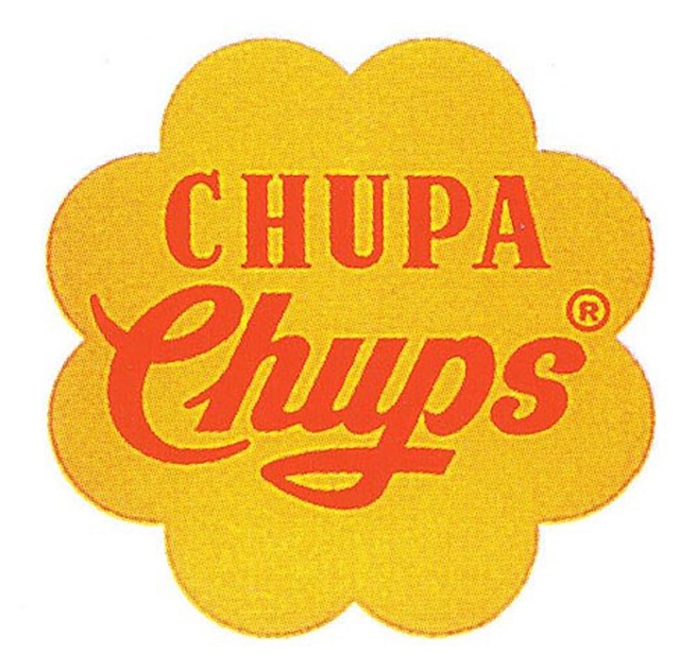 The original logo designed by Salvador Dali (1969)
 Image: Fast Company
Back in the mid-1960s, Tom Geismar – who was the co-founder of a prominent design firm known as Chermayeff & Geismar & Haviv – was commissioned to design a new logo and graphic identity for Mobil Oil Corporation.
This was prior to the Exxon Mobil merger that took place in 1999 but the signature red coloured font and distinct font that was designed by Tom still influenced the Exxon Mobil logo design today.
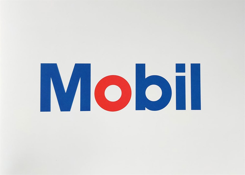 Mobil logo designed by Tom Geismar, 1964
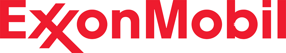 Post-merger logo reinvented from Tom Geismar’s original design
 Image: Pentagram
Known for her ability to seamlessly harmonise fine art and pop culture elements to create timeless, meaningful and modern designs, Paula Scher makes the list for her iconic logo design for Citibank.
In 1994, Paula made a name for herself when she became the first designer to be appointed to create a new identity and different promotional graphics for The Public Theater. Her use of a blend of san serif typography to create a graffiti-like style with traditional woodcuts earned her the Beacon Award in 1996.
She is also the first female principal at Pentagram since 1991 and is regarded as the ‘master conjurer of the instantly familiar’ as a homage to her instantly recognisable works. Beyond that, she has also been a collector of accolades, with her prized possession being the Chrysler Award for Innovation in Design in 2000.
“It took me a few seconds to draw it, but it took me 34 years to learn how to draw it in a few seconds.”
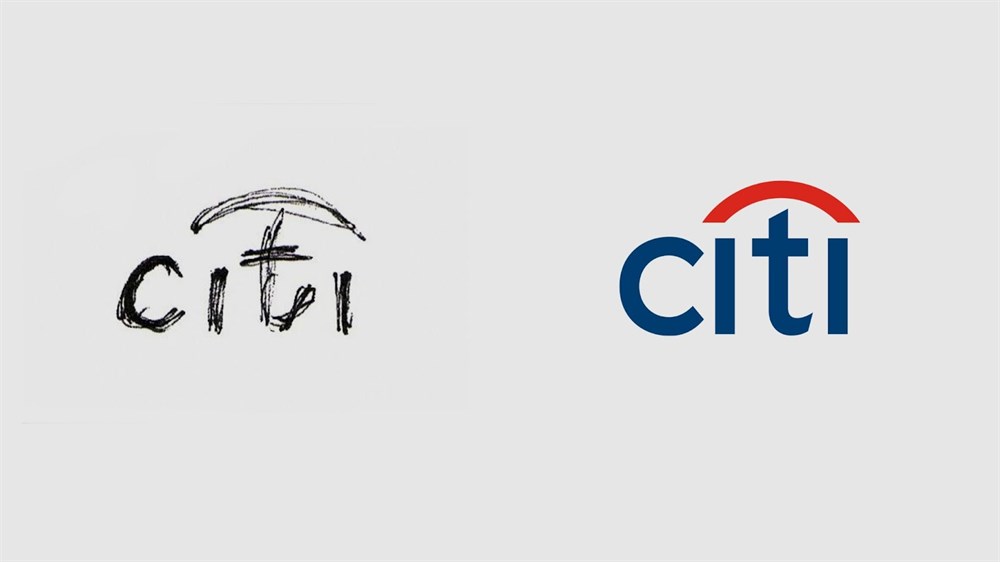 Image: Studio Output | Original sketch of the Citibank Logo
 Image: Forbes
In 1977, Rob Janoff worked for an agency, Regis Mckenna which acquired Apple as one of its start-up accounts. He didn’t have much to go on other than “Don’t make it cute” and “Don’t make it a bug”.
The directions came from former Apple CEO, Steve Jobs, who back then was more focused on getting a type treatment on the name than anything else. According to Rob, the logo we know and love today wouldn’t have existed if he listened to everyone else’s opinion.
He had two things to work with: the computer and a natural piece of fruit, and he was determined to add a little fun into the world of technology. Interestingly, the bite in the Apple logo was not meant to refer to the term byte (the unit measurement for the file size in computers) but instead, was meant for the logo to just look less like a cherry.
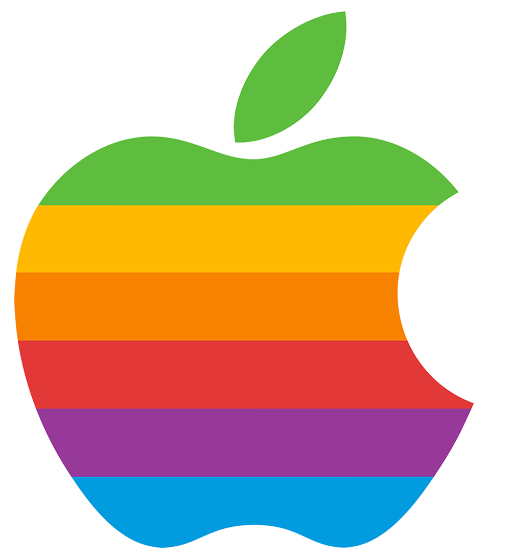 The original rainbow striped design for Apple by Rob Janoff
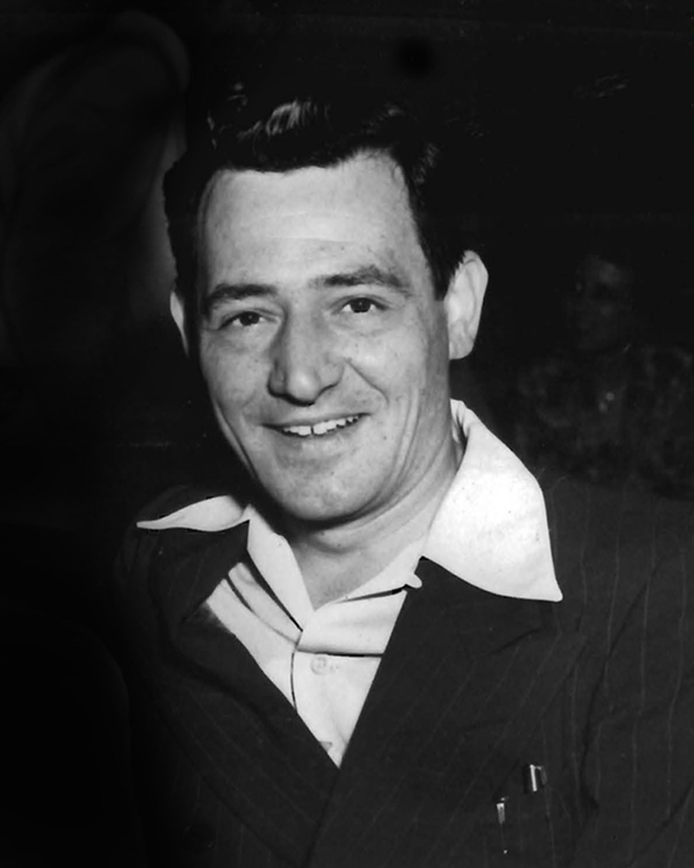 Image: NASA
It is quite a task to design something out of this world but James Modarelli was up for it. Before there was NASA, there was the National Advisory Committee for Aeronautics (NACA). During the merger between NACA and NASA, James Modarelli submitted his “meatball” insignia which included symbols that represented the space and aeronautics missions of NASA.
After some minor tweaking, former US President Eisenhower approved the seal in 1958 and described the design as such:
“On a disc of the blue sky strewn with white stars, to dexter a large yellow sphere bearing a red f light symbol apex in upper sinister and wings enveloping and casting a grey-blue shadow upon the sphere, all partially encircled with a horizontal white orbit, in sinister a small light-blue sphere; circumscribing the disk a white band edged gold inscribed “National Aeronautics and Space Administration U.S.A.” in red letters.”
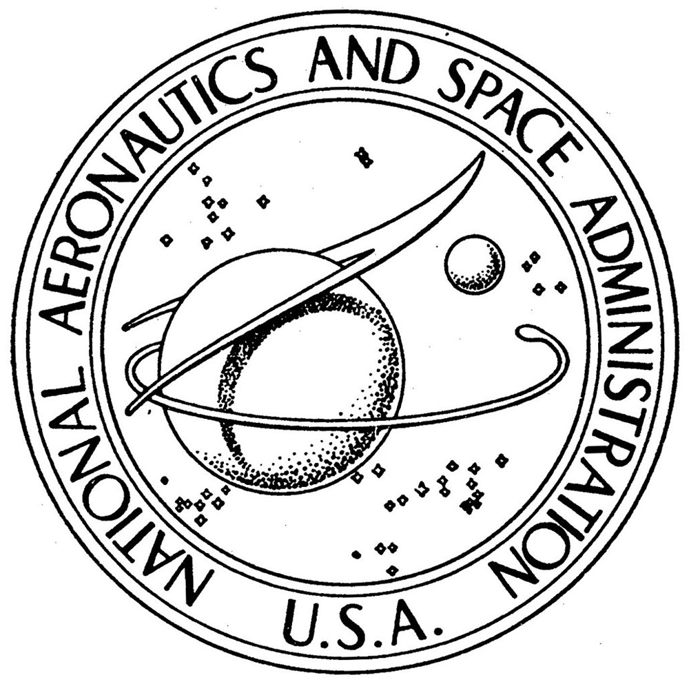 Image: SpaceandBeyondbox.com
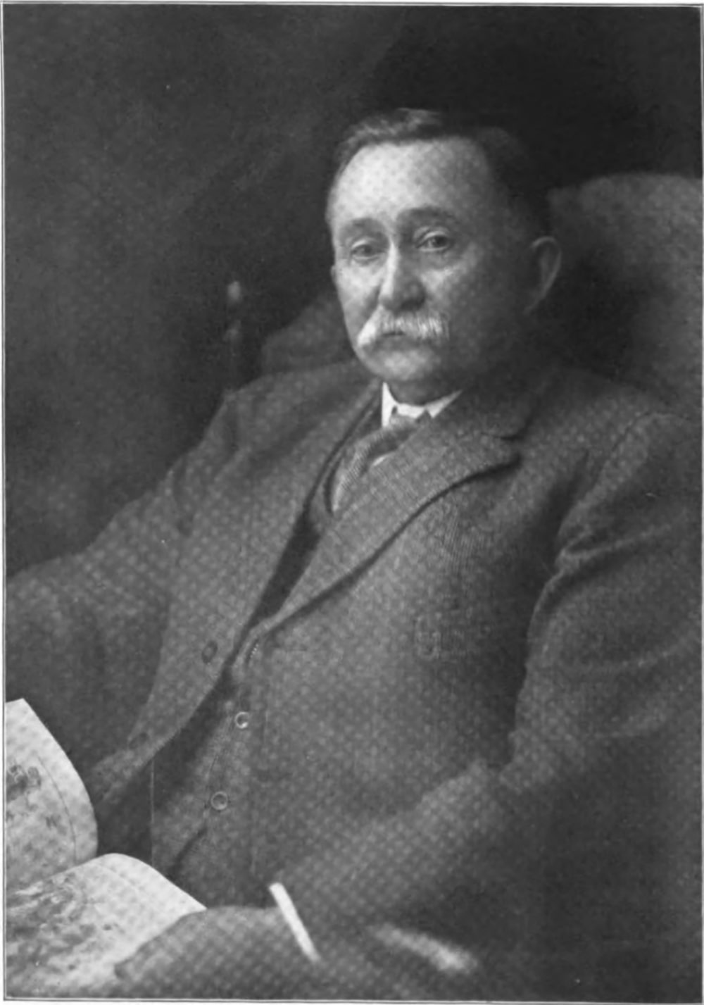 Image: Wikipedia
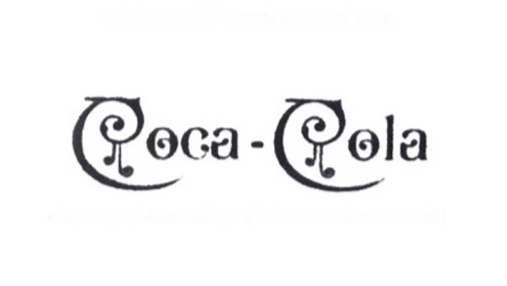
There is no doubt that Coca-Cola is one of the most recognisable brands in the world. Frank Mason Robinson was the man behind the iconic logo back in 1885 and a trailblazer in the world of modern logo design.
The iconic Coca-Cola design was a result of experimentation with Spencerian script which was unanimously adopted by Robinson’s company. It was drawn in flowing handwriting to exaggerate the C’s as he believed it would look good from an advertising perspective.
 The handwritten design by Frank Mason Robinson
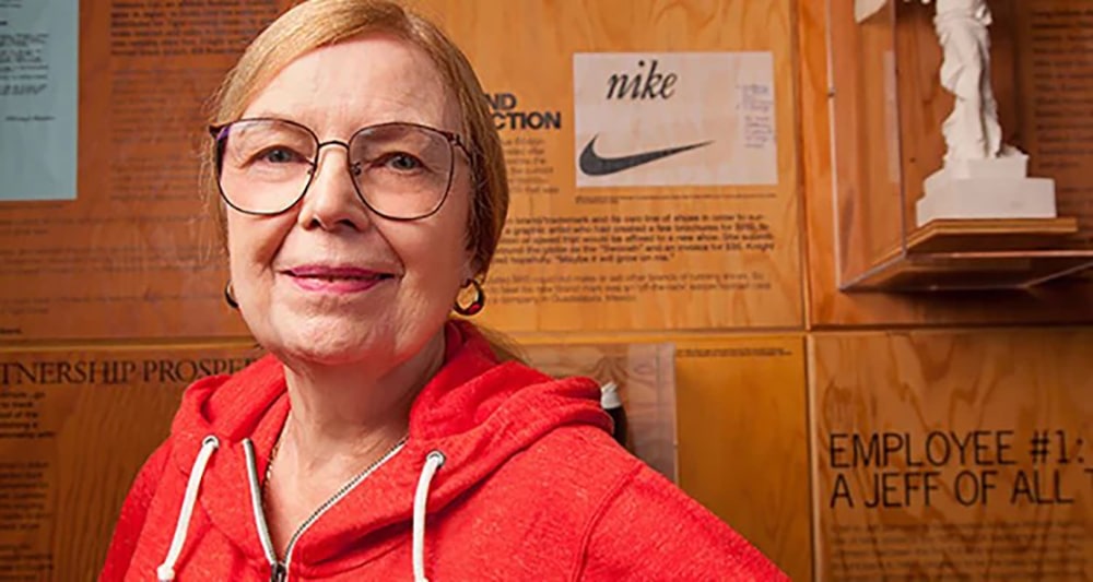 Image: Nice Kicks
It might be hard to believe that the renowned Logo Lady behind the iconic Swoosh was a graphic design student who took on the job to raise money for her oil painting supplies.
Back when Nike was known as the Blue Ribbon Sports, Inc. they created a simple brief for a logo that “had something to do with movement”, and Carolyn provided four designs that were rejected. Eventually, with looming deadlines, the signature Swoosh design was picked as the winner – although it was not exactly love at first sight for the designer’s supervisor.
 The iconic Swoosh by Carolyn Davidson
When the company went public in September 1983, Carolyn was presented with chocolate swooshes, a diamond ring engraved with the Swoosh and an envelope filled with 500 shares (estimated to be worth $1,000,000 as of 2015). This gesture came as a surprise to Carolyn who had initially billed only $35 for the design, which was already paid.
 Image: Raymond Loewy Org
French-born industrial designer Raymond Loewy was honoured with the title of the ‘Father of Industrial Design’ in recognition of his logo design for Shell.
The first version of the logo in 1971 was based on a large scallop shell. Then, the design took on a sleek art-deco style with neat lines to make the emblem look elegant yet strong.
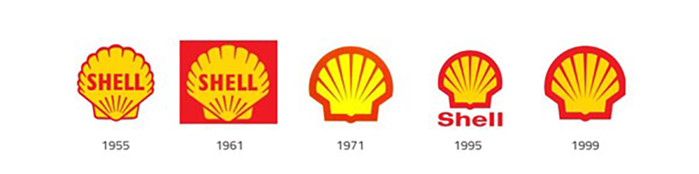 Image: Miro
 Image: Business People
The golden M design was the brainchild of Jim Schindler, who was McDonald's Head of Engineering and Design back in 1962. The brief was to bring a more “corporate” feel to the logo.
Jim Schindler decided to draw inspiration from the distinctive slanting roof of the restaurants cutting across the golden arches of the roofline, which resulted in the iconic golden M we all love and recognise today.
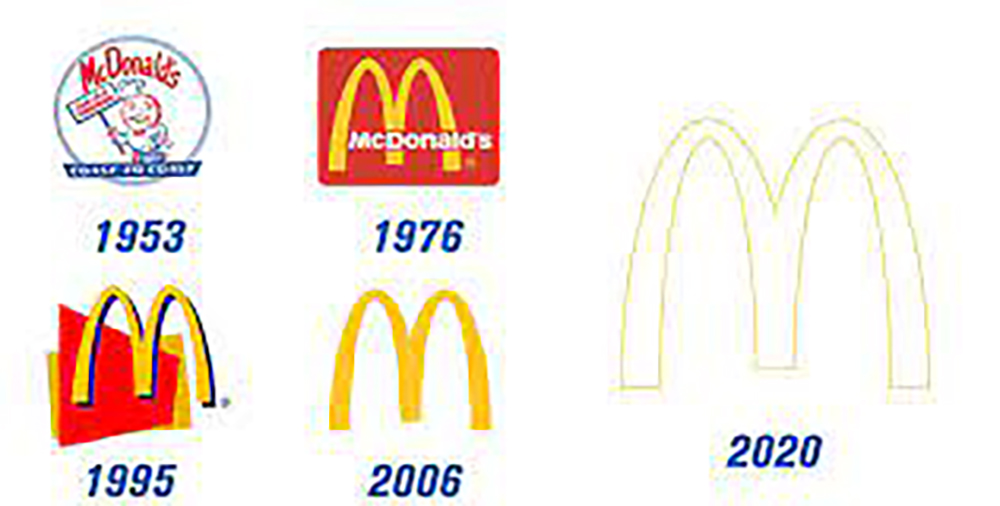 Image: Openlab
 Image: Grapheine
This list would not be complete without the legend of legends, Paul Rand. This modernist was the mastermind behind the logos for IBM, UPS, Morningstar and more, and was one of the early adopters of the Swiss style of graphic design.
This adoption was evident in his design of the IBM logo which featured the iconic triad, the eye, the bee, with the alphabet letter M, striped to match the body of the bee, to complete the rhesus. This logo has been used since its creation in 1972, so that’s something to keep in mind whenever you pass by an IBM building!
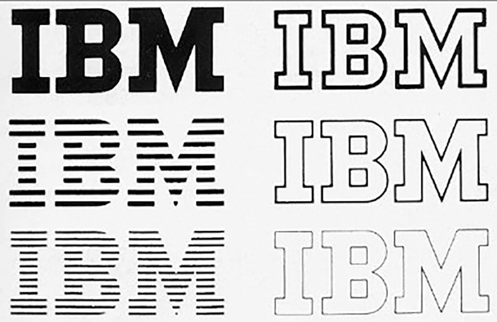 Image: Sandra James Talbot

Save yourself some time and effort with Brandripe’s on-demand graphic design services. It is our goal to join the ranks of these masters in making unique and distinctive designs for our customers. Take a look at what we have done for our clients here. Plus, since you have seen what a professional graphic designer can achieve for businesses in this article, here are even more reasons why you need to hire us for your business.
1. Our subscription model aims to safeguard your business
During the pandemic, we recognise that most businesses require flexibility to liquefy their assets during difficult times. As such, we offer complete flexibility so you can sign up, cancel, pause or resume your services with us as and when you need them.
2. Unlimited revisions and requests
As you’ve seen in this article, logo design plays an important role in your branding goals. Create positive and everlasting impressions by working with us to produce your designs until you are completely satisfied.
3. Creative and consistent graphic design
Our team of professional graphic designers are committed to creating unique and impressionable designs to help you stay in the hearts and minds of your customers.
4. Affordable pricing model
No matter how much work you need, we have a fixed monthly pricing model for you to stay on good terms with your finance department.
These are only a few good reasons why you should work with us, but we’d be happy to tell you more during our 15-minute VIP demo call and give you a behind-the-scenes induction. Who knows, this might be the first chapter of your brand story that will be told for generations – just like the 10 iconic ones we mentioned in this article!